Animation in R 🔥
Nowadays many data scientist are beginning to think about how to make their visualization more compelling with animation. Animation might help a viewer work through the logic behind an idea by showing the intermediate steps and transitions, or show how data collected over time changes. A moving image might offer a fresh perspective, or invite users to look deeper into the data presented. An animation might also smooth the change between two views, even if there is no temporal component to the data.
In this post we will learn about animation in R using gganimate package. Before learning about animation its important to have understanding of grammar of graphics using ggplot2.
About gganimate package :-
gganimatepackage is helpful in creating animation by extending the grammar of graphics which was implemented by ggplot2. So it provides a new feature or grammar of graphics to plot object.
transition_*():- So this new grammar defines how the data should be spread out and how it relates to data itself.
view_* ():- it defines that how the positional scales should change along the animation.
shadow_*():- defines how data from other points in time should be presented in the given point in time.
enter_*()/exit:- defines how new data should appear and how old data should disappear during the course of the animation.
ease_aes():- defines how different aesthetics should be eased during transitions.
Examples
#loading libaries and setting up theme setting
library(ggplot2)
library(tidyverse)
library(gganimate)
mytheme <- function(...){
                 theme(legend.position = "bottom",
                 legend.text = element_text(size = 8),
                 panel.background = element_rect(fill = "white"),
                 strip.background = element_rect(fill = "white"),
                 axis.line.x = element_line(color="black"),
                 axis.line.y = element_line(color="black"))
}
lets draw a simple plot first without any animation
p <- ggplot(iris, aes(x = Petal.Width, y = Petal.Length))+
  geom_point(aes(color = Species))+
  mytheme()+
  scale_color_brewer(palette = "Dark2")

plot(p)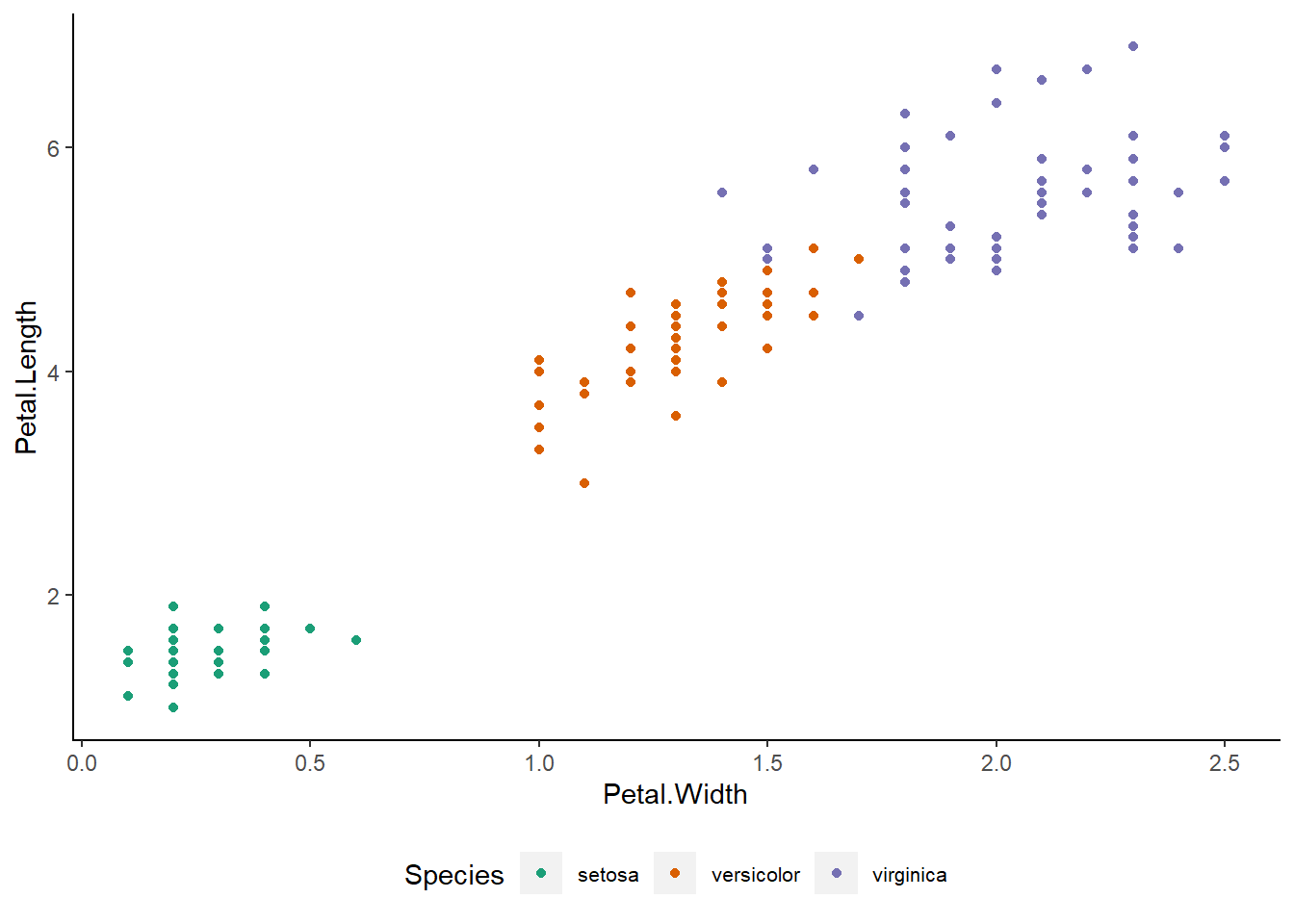
By simply addition type transition we can generate complex animation.
anim <- p + transition_states(Species)
anim
Transitions are functions that interpret the plot data in order to somehow distribute it over a number of frames.
Now we add two other arguements to transition_state :-
- transition_length :- It is relative length of transition.
- state_lenght :- It is relative length of the pause at the states.
anim <- p + transition_states(Species,
                              transition_length = 2,
                              state_length = 1)
anim
transition_states() splits up plot data by a discrete variable and animates between the different states.
Also note :- transition_states() specifically splits the data into subsets based on a variable in the data (here Species), and calculates intermediary data states that ensures a smooth transition between the states (something referred to as tweening).
Easing
When transition_states() calculates intermediary data for the tweening, it needs to decide how the change from one value to another should progress. This is a concept called easing.
anim+ease_aes('cubic-in-out')
ease_aes() defines the velocity with which aesthetics change during an animation
anim + ease_aes(y = 'bounce-out')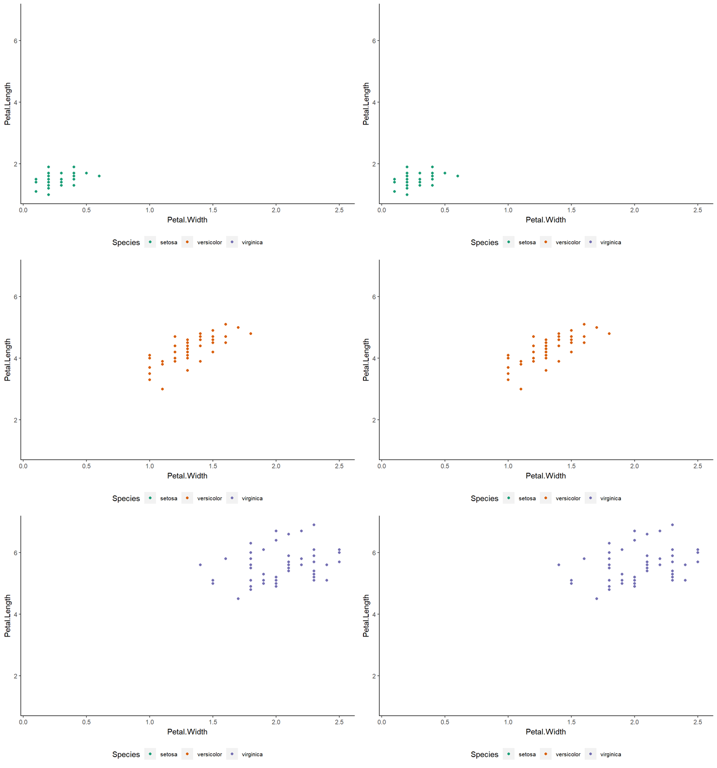
Labelling
Its important to know to what each point relates to in an animation. We can add a set of variables for each frame.Glue syntax is really helpful here for inserting into plot labels.
anim +
  ggtitle('Now showing {closest_state}',
          subtitle = 'Frame {frame} of {nframes}')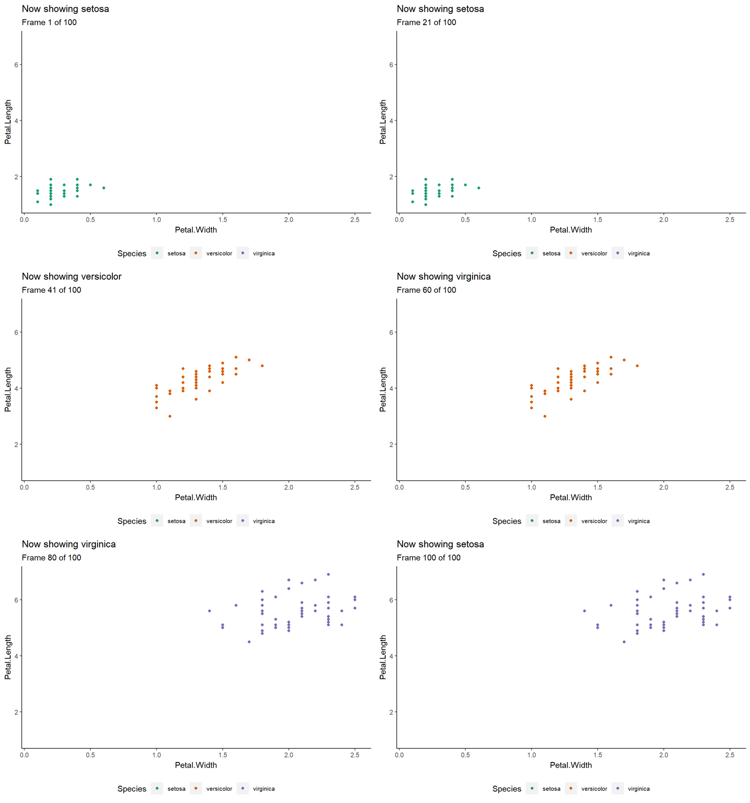
Enter and Exit
anim +
  enter_fade() +
  exit_shrink()
Examples
mtcars dataset
ggplot(mtcars, aes(factor(cyl), mpg))+
  geom_boxplot(aes(fill = cyl))+
  mytheme()+
  scale_color_brewer(palette = "Dark2")+
  transition_states(gear)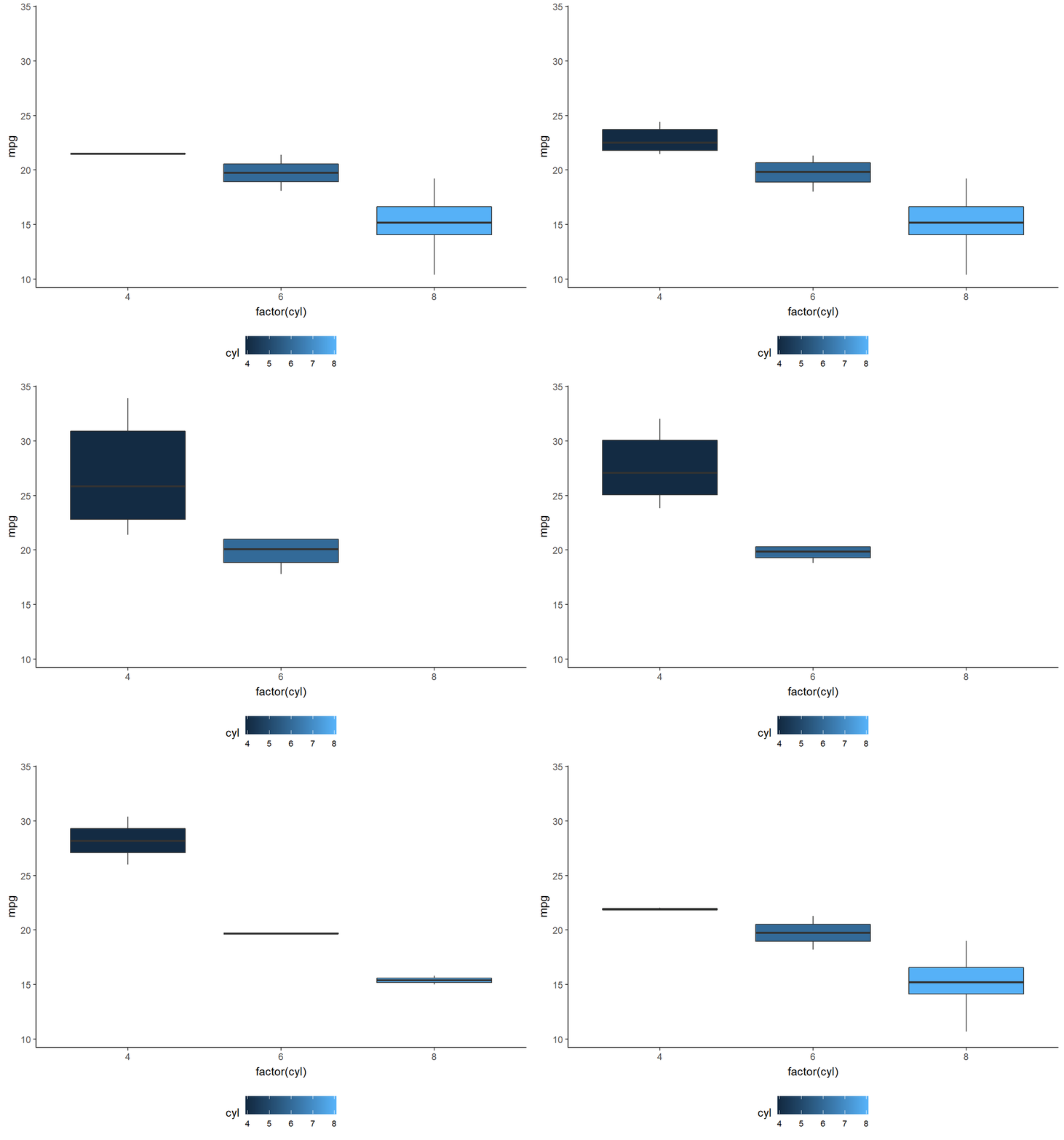
gapminder dataset
library(gapminder)

ggplot(gapminder, aes(gdpPercap, lifeExp, size = pop, colour = country)) +
  geom_point(alpha = 0.7, show.legend = FALSE) +
  scale_colour_manual(values = country_colors) +
  scale_size(range = c(2, 12)) +
  scale_x_log10() +
  facet_wrap(~continent) +
  # Here comes the gganimate specific bits
  labs(title = 'Year: {frame_time}', x = 'GDP per capita', y = 'life expectancy') +
  transition_time(year) +
  ease_aes('linear')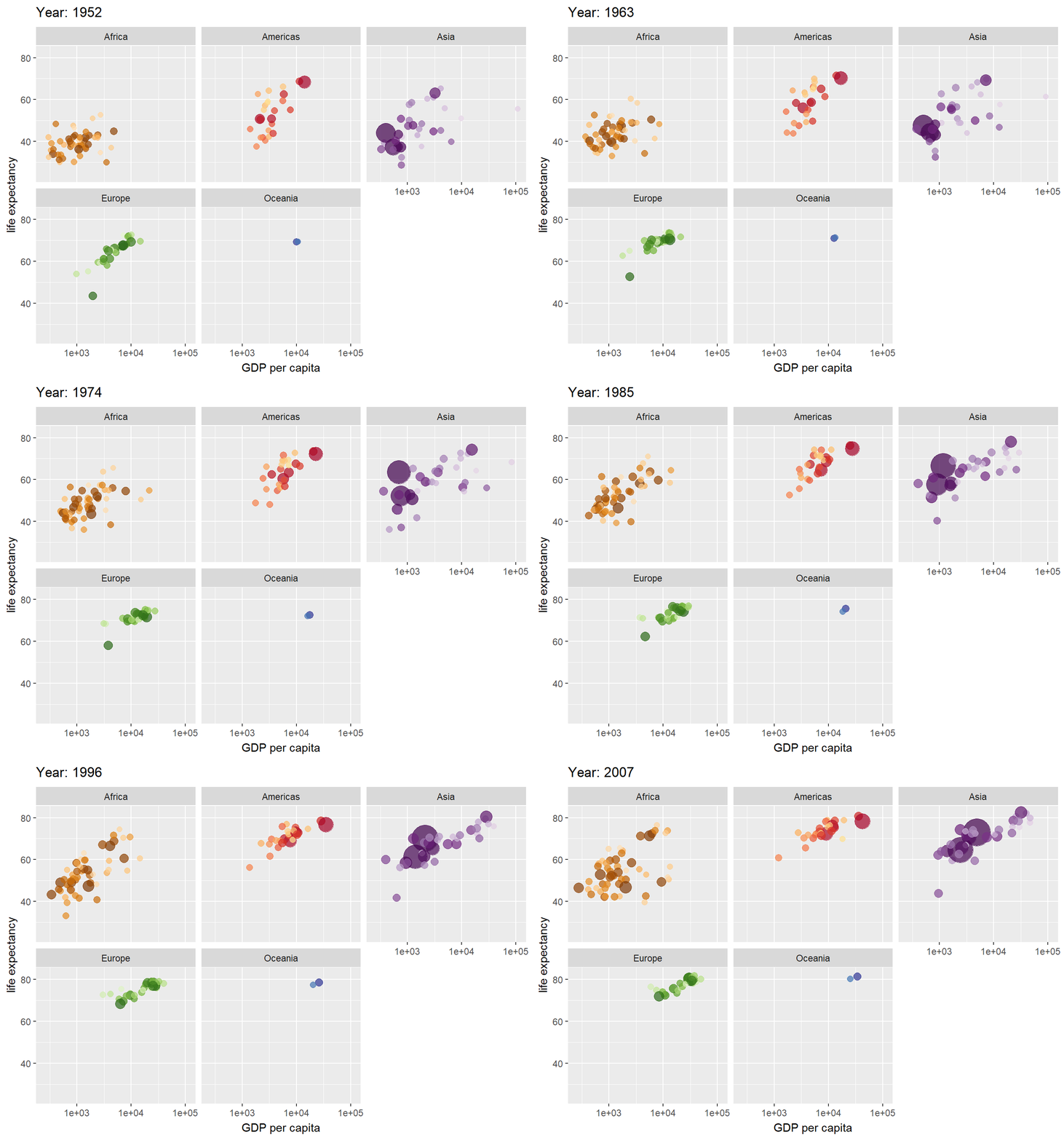
gdp dataset
df <- read.csv("D:/git/vidyasagarblog/Data/world_gdp.csv", stringsAsFactors = FALSE)
df1 <- gather(df,"year", "gdp" ,2:59)
df1 <- df1 %>% arrange(Country.Name, year)
df1 <- df1 %>% rename(country =Country.Name)
df1$year <- as.numeric(gsub("[a-zA-Z ]", "", df1$year))
s_total <- df1 %>%
  group_by(country) %>%
  count()
df1[is.na(df1)] <- 0
df2<- df1 %>% filter(country%in%c("United States", "China", "India", "United Kingdom","Japan", "France" ,"Germany"))
df2$year <- as.integer(df2$year)
p <- ggplot(df2, aes(year,gdp, color = country,group = country))+
geom_path()+
geom_point()+
facet_wrap(~country)+
theme(legend.position = 'none') +
labs(title = 'GDP, Year: {frame_along}') +
transition_reveal(along = year) +
ease_aes('linear')+
view_follow()+
mytheme()+
scale_color_brewer(palette = "Dark2")
animate(p, 200, 300)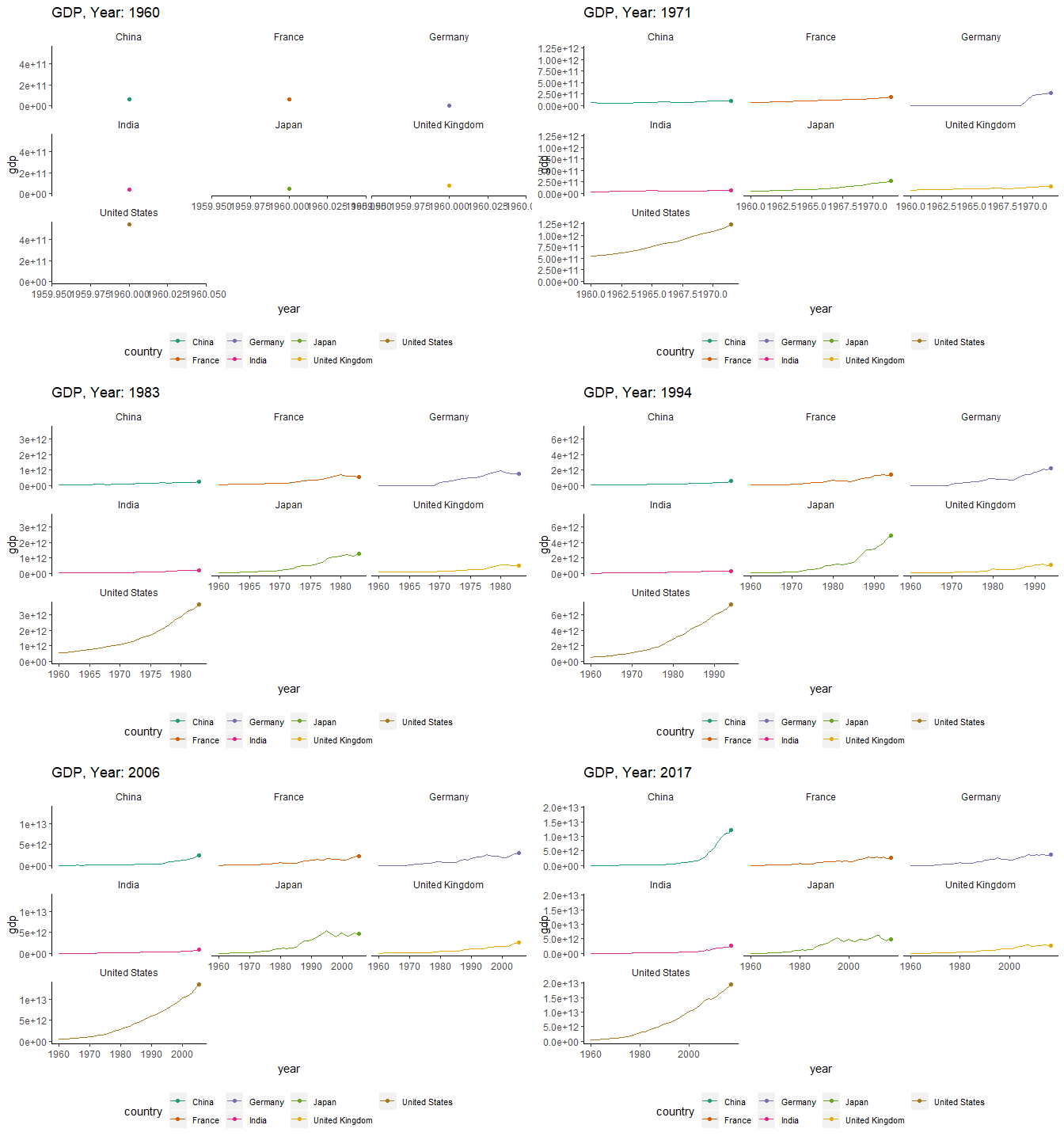
China Vs India GDP Comparison over the years
df2<- df1 %>% filter(country%in%c("India","China"))
df2$year <- as.integer(df2$year)


p <- ggplot(df2, aes(year,gdp, color = country,group = country))+
  geom_path()+
  geom_point()+
  labs(title = 'GDP , Year: {frame_along}') +
  transition_reveal(along = year) +
  ease_aes('linear')+
    mytheme()+
  scale_color_brewer(palette = "Dark2")
animate(p, 200, 300)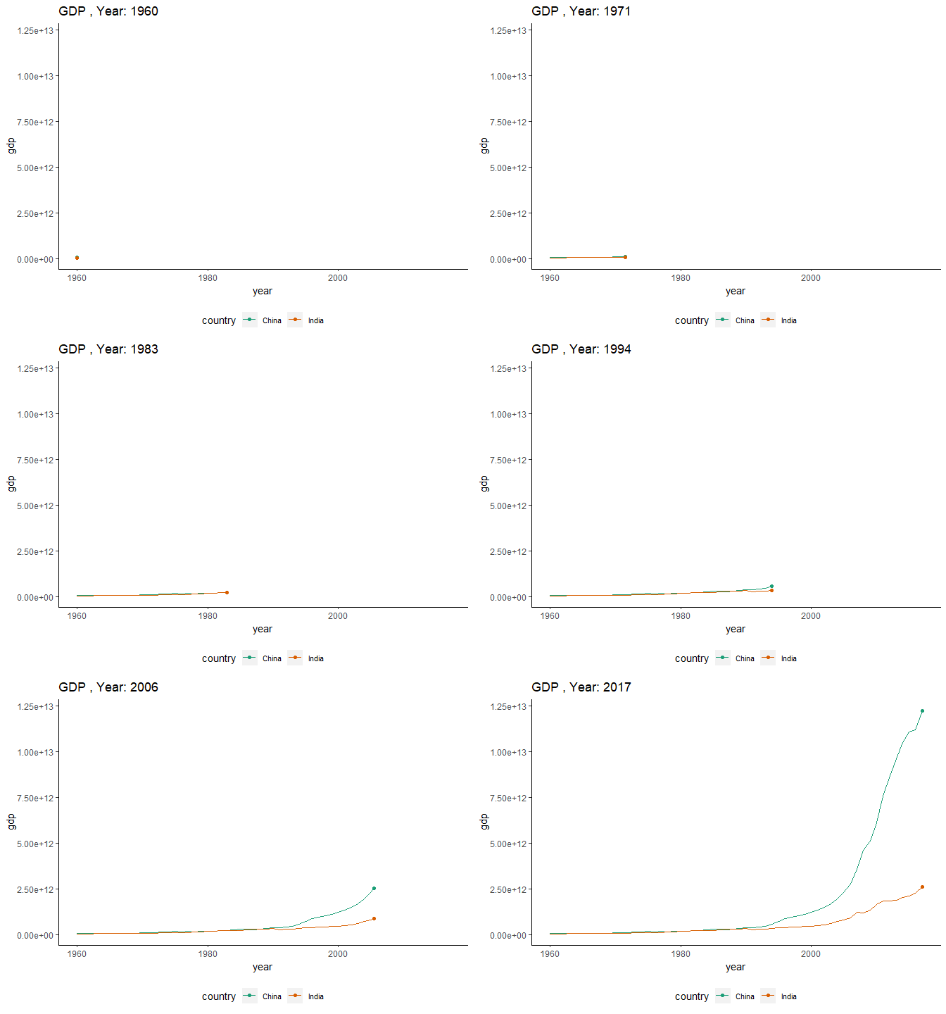
rayshader 🔥
rayshader is an open source package for producing 2D and 3D data visualizations in R.It allows the user to translate ggplot2 objects into beautiful 3D data visualization. To learn more about this package click here.
library(rayshader)

gg = ggplot(diamonds, aes(x, depth)) +
  stat_density_2d(aes(fill = stat(nlevel)),
                  geom = "polygon",
                  n = 100,bins = 10,contour = TRUE) +
  facet_wrap(clarity~.) +
  scale_fill_viridis_c(option = "A")#

plot_gg(gg,multicore=TRUE,width=5,height=5,scale=250)